- PoolParty Semantic Suite Documentation
- PoolParty GraphViews
- Navigating the GraphViews User Interface
Navigating the GraphViews User Interface
21/08/2025
This guide will walk you through the key features of the GraphViews user interface. You can explore our public demo for a hands-on experience. For information on installation and configuration of GraphViews, refer to our dedicated help page.Install and Configure PoolParty GraphViews
GraphViews helps you explore your taxonomy with a simple and user-friendly user interface.

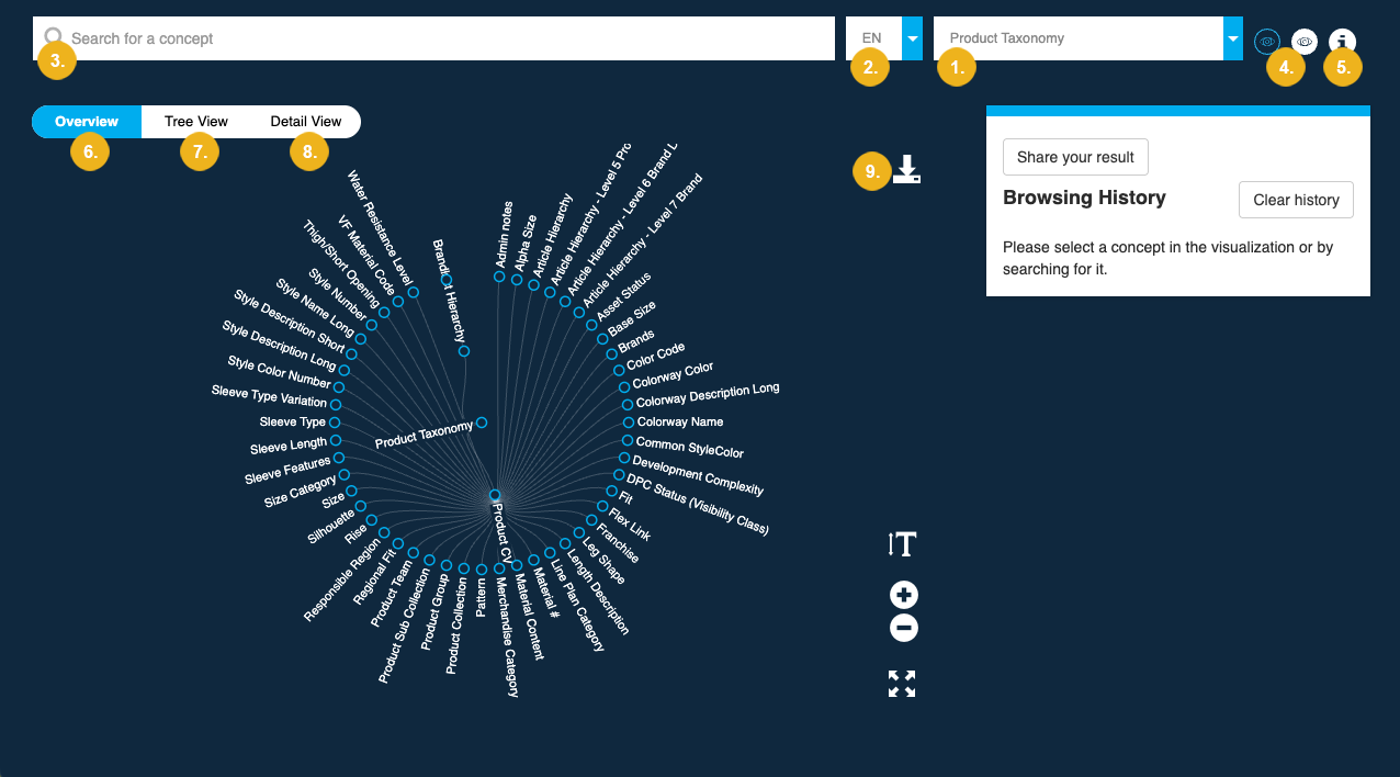
Use the project picker (1) to switch between your taxonomies. The language picker (2) allows you to filter projects by language, including any alternative associated with your projects.
Use the search bar (3) to find concepts in your project.
You can switch between light and dark mode by clicking the respective icons (4).
To display general information on GraphViews, select the info button (5) in the top right corner.
GraphViews offers three distinct visual representations of your data: Overview (6), Tree View (7), and Detail View (8). You can download any of these visualizations as a
.pngimage using the download (9) button.
GraphViews presents your project data through three different views.

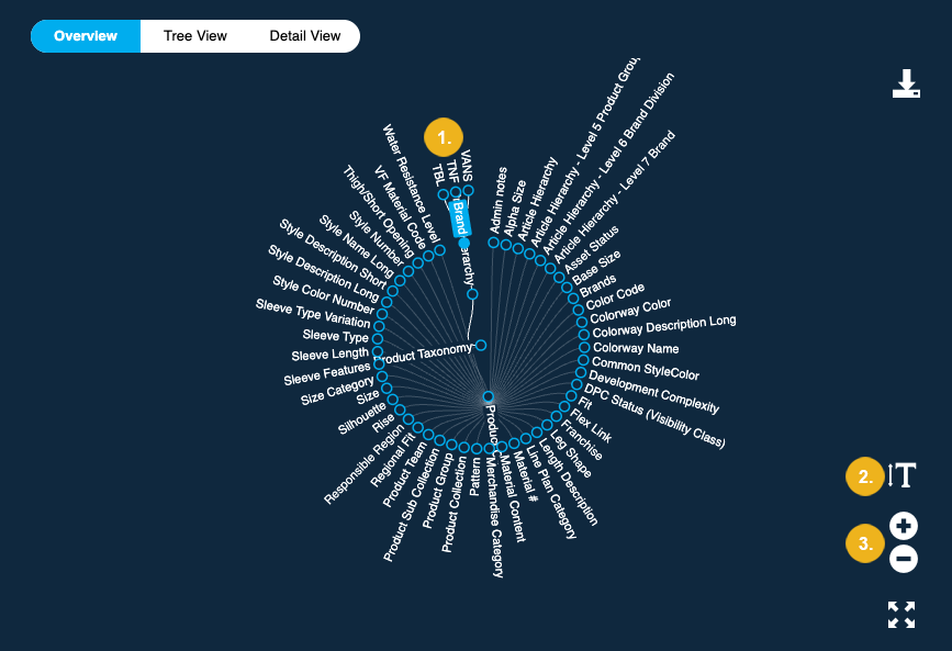
The Overview tab displays your project as a radial diagram. The central node represents the project with concept schemes and top concepts arranged in a circle around it. By default, only these top levels are shown. You can expand the view to see any existing narrower concepts (1) by double-clicking any node on the outer rim. The controls in the bottom right corner allow you to adjust the font size (2) and to zoom in and out of the diagram (3).

The Tree View presents your project in a vertical, hierarchical layout. By default, it shows only the first three levels of the hierarchy, similar to the Overview. When you double-click a node, all concepts from other concept schemes collapse, allowing you to focus on a single branch.

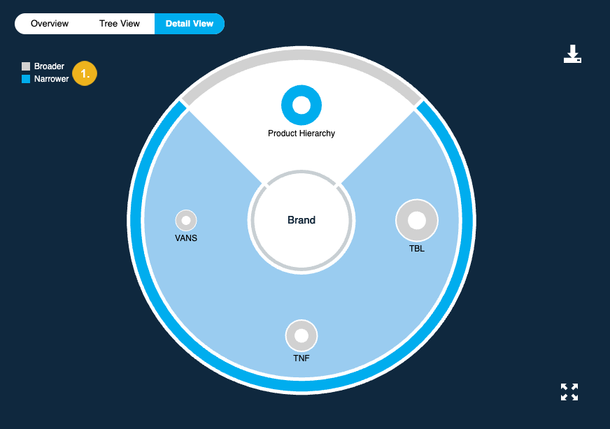
The Detail View provides a focused, single-node view. It shows a pie chart of the selected node, arranging its related concepts (broader and narrower) around the selected node. The size of each bubble corresponds to the number of its narrower concepts. Larger bubbles represent nodes with more narrower concepts, while smaller bubbles represent those with fewer. The color of each bubble indicates its relationship type to other concepts. A legend (1) in the top-left corner of the visualization explains the meaning behind each color.
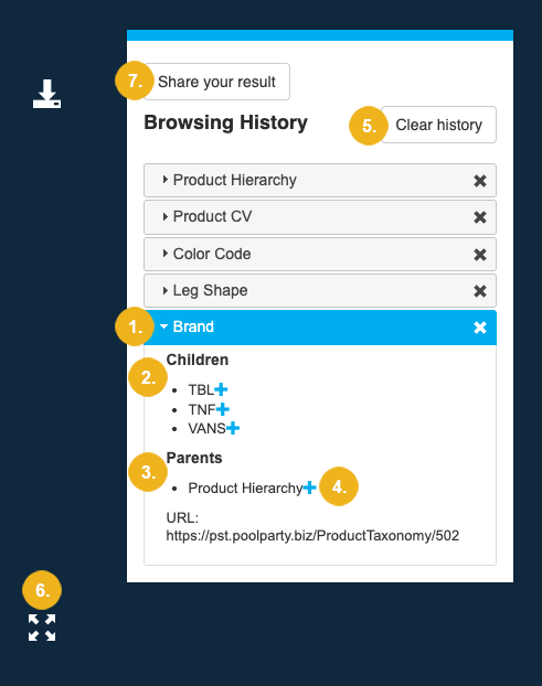
The Browsing History panel on the left side of the screen keeps track of the nodes you have selected.

Each time you select a node, a new tab appears in this panel. Use the arrow (1) next to a concept's name to expand it and view any existing Children (2) or Parents (3) of the selected node.
You can also select a node by clicking the Add Concept (4) button next to it. This allows you to sequentially navigate the knowledge graph.
To clear your selections and return to the default view, click the Clear history (5) button.
The Fullscreen icon (6) in the bottom right corner of the visualization hides the Browsing History panel, giving you a larger view of the graph. Click it again to restore the panel.
Copy a snapshot of your visualization to your clipboard by clicking the Share your result button (7).